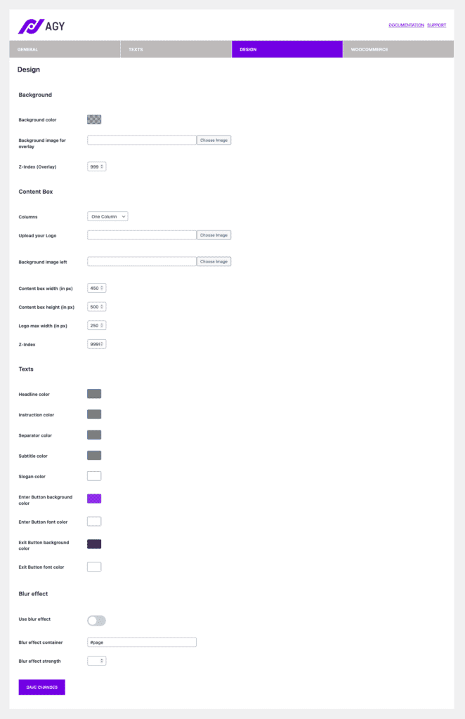
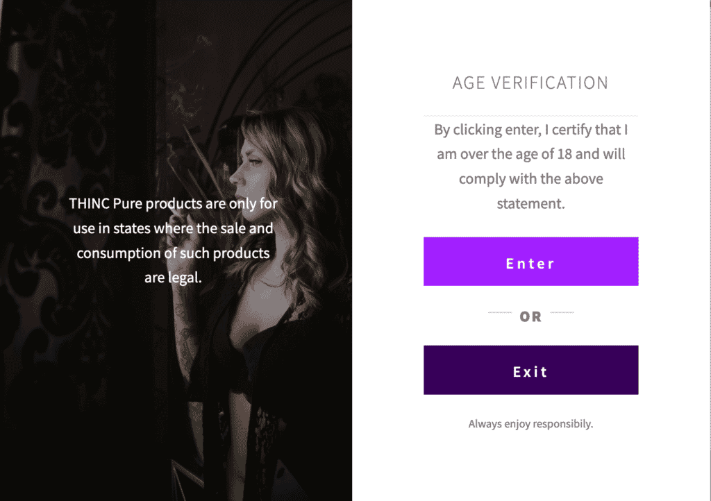
Go to WooCommerce->Agy->Design to modify the Look and Feel of your Age Gate. From changing colors, spacing, and setting background images or uploading your logo – you can customize it to fit your needs here.
Table of Contents
Design Settings

Background
Here you can define a background color for the overlay (also in RGBA for transparency) or set a background image for the full-screen overlay. The z–index property specifies the stack order of an element. It’s simple: if you don’t see the overlay, increase the value until you see it.
Content Box
Agy comes with a column setting. Choose one column for the default and two columns if you want to add an additional image and display the text from the slogan setting in “Texts”. You can also set a maximum width for your Age Gate and modify the z-index. Make sure the z-index from the content box is always higher than the z-index from the overlay.

Texts
That’s pretty self-explanatory: Modify the background and font colors for any text which appears in the age gate.
Blur effect
You can blur the entire background of your website before the user verifies his age. This is a bit more modern and elegant way to hide the content but not put an entire picture in the background.
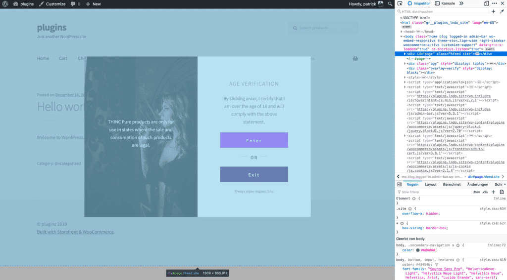
The blur effect container needs to be your parent container from the website which is above the overlay container. Here is a small screenshot to show you how to find it:

The last setting is about the intensity of the blur effect. Choose a value from 0 to 2 and adjust it according to your needs.